
In Praise of Blandness
Beauty is in the eye of the beholder, or so the age-old adage would have us believe. Some of us could stand before Jackson Pollock’s One: Number 31 for hours, marveling at its dense intricacies, like watching a Charlie Parker solo spring to life. For others, it receives as much regard as the forced smile you give when a friend shows you their 2yr old’s finger painting.
Still, there remains a certain aesthetic that draws universal acclaim. Games like Scythe and Abyss regularly top lists discussing beautiful game art and the industry has seen a marked drive toward setting high standards in art and component design. And for good reason. We are a species that assigns a great deal of value to visual appeal and with the board game industry growing ever larger, these aspects receive much attention. From box cover art to promotional material, the war for our eyes is a frenzied one.
This trend has never been more evident than on Kickstarter and I’d argue has been a massive factor in which campaigns perform the best. Six of the eight most funded tabletop projects feature miniatures, and the other two are both based on incredibly popular and highly stylised comic strips. Fair enough, I love a well produced mini as much as the next guy and striving for excellence in all facets of game design isn’t inherently a bad thing, but looking at that list does give me pause to think. Are any of those top eight games actually any good?
Don’t you just hate those Euro games with the beige colour palette…
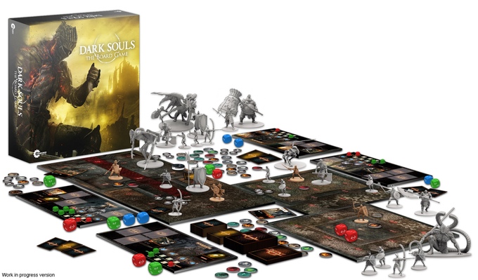
Not all of them have been released yet, but Joking Hazard and Exploding Kittens are glorified party games, and the balance are all dungeon crawlers…er, I’m sorry, combat exploration games. I’m not taking a dig at Kickstarter nor begrudging those games their success – they’re in the top eight because we put them there. There will always be a group of us who prefer the elegance and clean design of games like Kumo Hogosha over the busyness of Zombicides and Massive Darkness’, but we are in the minority and likely always will be. Pretty art certainly isn’t the only reason those exuberant campaigns perform as well as they do, Dark Souls is the embodiment of the ‘look at all this stuff you’ll get’ approach to marketing and it’s just far easier to convey theme on a platform such as KS.
But not every game is a battle for survival in a post-apocalyptic wasteland or political scheming in a twisted aquatic wonderland. Perhaps there’s a small farm on an island that just wants to be the best little farm it possibly can, or just maybe it’s time for an industrial revolution in northern England. That’s not to say that games focusing on agriculture or Cold War socio-economic policy can’t look amazing – The Gallerist is a triumph of art design for a theme that is a far cry from cleaving demonic heads from shoulders.
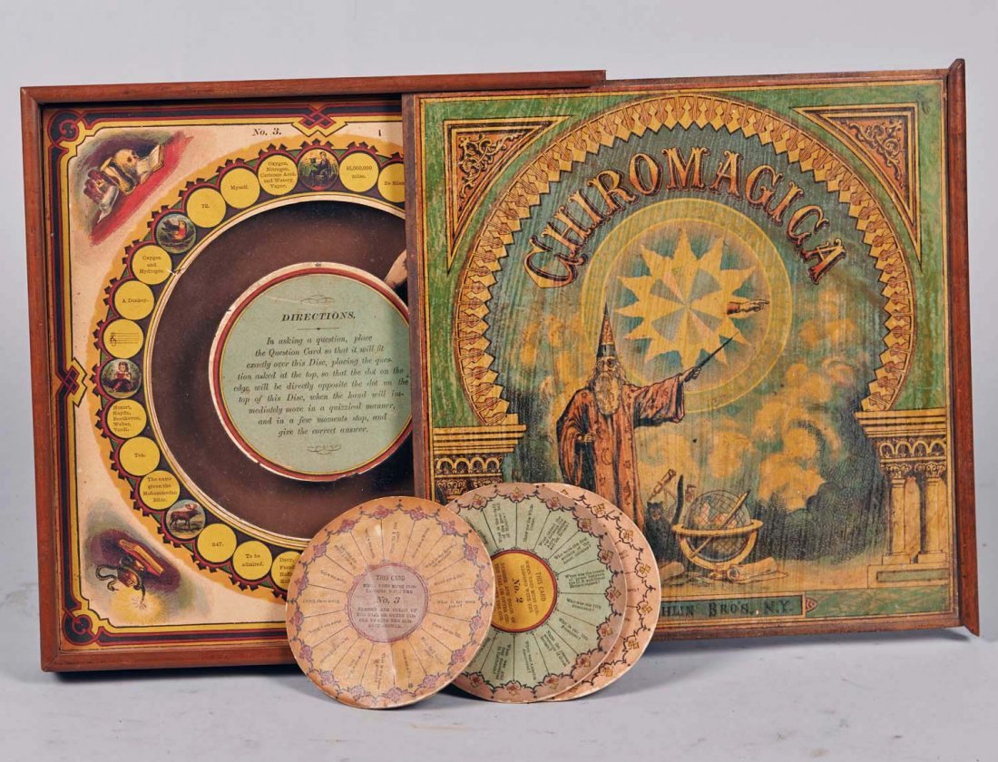
Chiromagica, first released in 1870. Fantastic art design is not a modern concept.
Which leads me finally to the question that spurred the writing of this feature – is our focus shifting too far toward arresting the eye instead of the mind? What are the implications for an industry that has always set itself so clearly apart from its digital neighbours, and yet seems to be meandering down a similar path? One doesn’t need to be a participant in the video game arena to be aware of the endless debate around the obsession with graphical improvements and just how that has affected the quality of games, are we increasingly becoming a mirror for those trends? We’ve already seen it with many of the pseudo-subscription models that crop up frequently, the add-ons for games like Imperial Assault as a form of DLC, is it that hard to imagine we may be in danger of distracting ourselves with the siren call of ever more intricate miniatures and ‘amazing graphics’?
Listening to a review of Cry Havoc recently, one of the criticisms noted was against the actual game board and how it appeared somewhat bland against the card artwork. It’s a valid criticism, and I’m sure I’ve held similar against other games in previous reviews, but I do wonder how much that has to do with the game being a victim of the heightened expectations we wear these days like a second skin. Would we have made the same observation five years ago?
And yes, this is part and parcel of an evolving industry. We have an obsession with perceived quality that’s evident from the film industry to the recording of music – of course it would ingrain itself within the boardgame industry as well. Transformers movies? Big on visual spectacle, low on pretty much everything else. Now there’s no need for alarm bells just yet. Boardgame enthusiasts are not easily fooled and the most beautiful game ever created would fall flat if the gameplay behind it wasn’t engaging. And is there inherently an issue with desiring an increase in the quality of artwork to begin with? It’s easier and cheaper to achieve than ever before, is it not to the benefit of all that this trend continues?
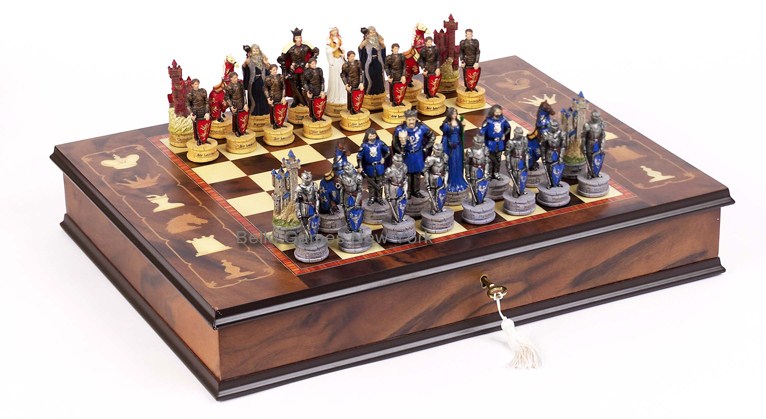
Man, chess is one UGLY looking game…
The obvious answer is yes, and I don’t doubt that most of us could compile a list of reasons why fairly quickly. But there’s also a no in there that’s easy to overlook, at our own peril. I think we should be careful not to narrow the definition of beautiful. The beauty innate to a boardgame isn’t just in how attractive the artwork is, there’s an allure to the geometry of it all – hexes and cubes and circles – an art to the layout that should elicit ‘how does that all work’ rather than ‘ooh, pretty’. There’s a reason that despite numerous attempts at glittering it up, chess remains a game that has transcended the need to look like anything more than what it is.
A bland looking game has nowhere to hide, nothing with which to lure using smoke and mirrors. It lives and dies by the strength of its gameplay. You’ll never hear someone lamenting that if only Puerto Rico was a better game because it’s just so pretty. In contrast, I’ve witnessed plenty of disappointed faces when a great looking game fails to deliver on gameplay, and it’s fascinating watching the internal process of justification – finding ways to make ourselves believe the game is better than it really is because we know we were duped by the bells and whistles even though we don’t want to admit it.
For me personally, I find myself becoming more concerned about the strength of a game’s identity rather than its looks. Fantasy Flights’ Terrinoth universe is a great example – as each iteration of Runebound and Runewars gets more and more attractive, there’s a genericism that’s nigh impossible to escape. Identity may still be as tricky a concept to define as beauty, but it certainly encompasses far more. And while it’s true that identity becomes far harder to express in a crowded room, doesn’t that make it all the more telling?

An early edition of Cosmic Encounter. There’s a certain charm to it, no?
There’s no shortage of excellent titles being released, that’s for sure. So why the concern? I’m no Luddite – I’m as enamoured with the march of technology is the next person and I’m absolutely for the integration of digital technology into boardgaming – but there’s a key reason why our obsession with movies and videogames drives the industry toward increasing levels of realism. We want to feel like we’re a part of the worlds those mediums create. And that’s precisely what makes boardgaming so special – they too are a form of escapism, but it’s an escapism that is grounded in an interaction with reality and not an effort to transcend it. As Stuart so excellently put it when I was bouncing ideas for the feature off him, ‘We create our own immersion, instead of being fed it’. And that sense of immersion is as much a product of contemplating strategies as it is pretending to be a butler so weak he can’t even break a glass cabinet (Mansions of Madness reference), luring an opponent into an artfully constructed trap or defending a colony from gun-toting mutants.
As fearful as I am about boardgaming mirroring its digital counterpart too closely, I’m also comforted by the rise of the so called Indie genre, which in many ways is a reaction to a AAA industry focused on aesthetics. Not only has it encouraged those who lack AAA resources to get involved with making their flights of fancy a reality, but it has very much thrust the notion of identity front and center once again, giving us the Undertales and the FTLs of the indie world. So let’s think about the message we want to send designers, about the kinds of games we hope to experience in the future. Gorgeous is good, gorgeous is fine. But beauty can only exist when there is diversity. I want the Concordias as much as I want the Scythes, because I want games that put identity before visual appeal, that will garner as much hype for their mechanical design as they will for their box art.
SO BLAND
Right, I’ve got one engine failure and I’m losing altitude fast, time to land this thing. I titled this piece In Praise of Blandness, which was a little naughty and a touch disingenuous. Not every game lends itself to spectacular imagery, and nor should it. There’s no Flick ’em Up without Crokinole, no Five Tribes without Mancala. Graphical evolution is important, but not at the cost of diversity and cultivating innovation. It’s not about praising games because they’re decked out in all beige, but because of their importance to the hobby in spite of it.
Let’s encourage designers to focus on the strength of a game’s identity, of which graphic and art design is simply one cog of many. Part of that encouragement is reminding publishers that your medieval French city can look as charming as Orléans without compromising its Euro disposition, but more importantly for me at least, your end goal should always be to win the mind of the consumer whether or not their eyes have been sated.
Unless it’s Roll to the South Pole, because I want to sleep at night.
What do you think? Much ado about nothing? Are there aspects of the industry that you feel do emphasise looks over gameplay? Do you spot similarities between the digital world’s obsession with graphics and what we see developing in our own hobby? I’d love for you to share your thoughts.
Related Posts


About The Author
Grim
Paul thinks about board games a lot. Mostly when he should be thinking about school fees and Eskom and staff meetings. In other words, Paul's clearly got his priorities in order. Constantly lamenting the lack of Mage Wars opponents.
-
Starlit Citadel
-
grim
-
Starlit Citadel
-
-